
Upload a Picture
About this Site | Links | Random Pic | Advanced Search
Home | Latest Additions | Contributors
| Visitors
Fire Engine Photos
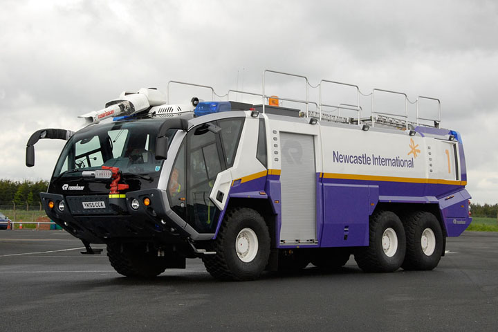
Impressive machines - very futuristic.
Who woulda thunk that purple would work ?!
I imagine that the colour scheme matches other airport vehicles and buildings for a Marketting Theme/Product Identity - advertising idea, for promoting business through Newcastle Airport, etc.
What are the differences between this one and her sister "No. 2" ("Crash 1" and "Crash 2" ??) in picture 12798 ?
I can see the big Foam Monitor and the Snozzle; the Bumper-Mount Nozzles.....
Regards, from Canada,
Pat_R-B
Regards, from Canada,
Pat_R-B
Added by Pat Rivers-Bowerman on 04 December 2008.
Pat, the snozzle is for high engine work etc. As for the colour, some airports dont like red as it doesn't fit the corporate image and they think fire engines frighten the public.
Added by John Stott on 04 December 2008.
Added by John Stott on 04 December 2008.
Rosenbauer


Added by John Stott on 03 December 2008.